
Top Tools for Customizable PR Dashboards
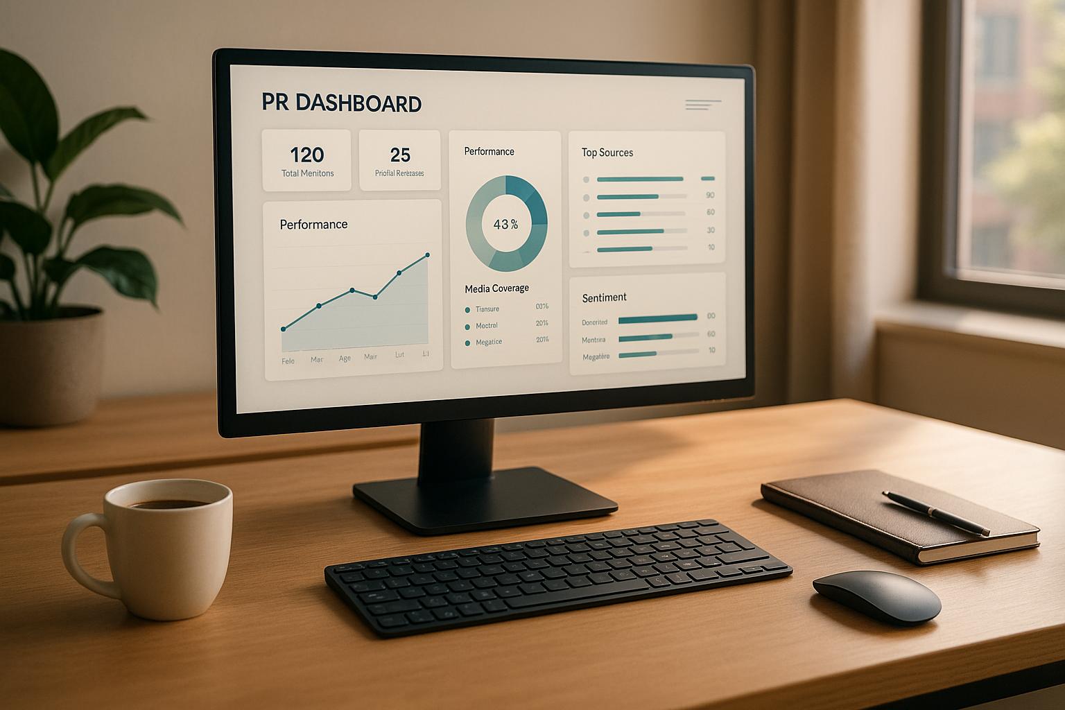
Customizable PR dashboards are essential for modern PR teams to track performance metrics, media impact, and campaign success in real time. This article reviews five leading tools - Pressmaster.ai, Klipfolio, Whatagraph, Tableau, and Domo - each offering unique features like real-time analytics, integration options, and white-label capabilities.
Key Takeaways:
- Pressmaster.ai: AI-powered, PR-specific features like sentiment analysis, media tracking, and white-label branding.
- Klipfolio: Affordable, versatile dashboards with drag-and-drop customization and API integrations.
- Whatagraph: User-friendly, pre-built templates ideal for agencies managing multiple clients.
- Tableau: Advanced data visualization for complex campaigns, suitable for enterprise needs.
- Domo: No-code dashboards with extensive data connectors and live updates for large-scale operations.
Quick Comparison:
| Tool | Customization | Integrations | White-Label Options | Real-Time Analytics | Starting Price (USD) |
|---|---|---|---|---|---|
| Pressmaster.ai | High (PR-focused) | Media, CMS, Social | Yes | Yes | Custom pricing |
| Klipfolio | High | 130+ platforms | Yes | Yes | $19/month |
| Whatagraph | Moderate | 100+ platforms | Yes | Yes | $249/month |
| Tableau | Advanced | 100+ connectors | Limited | Yes | $15/user/month |
| Domo | High | 1,000+ connectors | Yes | Yes | Quote-based |
Choose the tool that aligns with your team size, budget, and reporting needs. Whether you're tracking sentiment, managing multi-client campaigns, or diving deep into analytics, these platforms simplify PR workflows and improve decision-making.
Public Relations PR Dashboard in Power BI
1. Pressmaster.ai

Pressmaster.ai is an all-in-one platform powered by AI that simplifies the entire PR process - from creating content to analyzing performance. It’s a go-to solution for organizations looking for a tool that combines automated content generation, distribution, and performance tracking into one seamless experience.
Customizable Dashboards
Pressmaster.ai allows PR teams to design dashboards tailored to their needs. Teams can choose key metrics, tweak visual elements like charts and branding, and organize layouts to focus on the data that matters most - whether it’s media coverage, sentiment analysis, or engagement rates. These dashboards don’t just deliver insights; they also ensure brand consistency when shared with stakeholders or clients.
The platform’s unified analytics dashboard pulls metrics from all connected platforms, eliminating the hassle of switching between multiple tools. PR teams can adapt their dashboards to align with specific campaign goals. For instance, during a product launch, they might focus on tracking media mentions and sentiment shifts. On the other hand, long-term brand awareness efforts might prioritize metrics like share of voice and social media engagement. This flexibility ties seamlessly into the platform’s broader integration features.
Integration Capabilities
Pressmaster.ai excels in integration, connecting effortlessly with websites, Content Management Systems (CMS), and social platforms. Supported platforms include WordPress, Wix, Medium, GoHighLevel, and Webflow, enabling users to manage all their digital properties from one central hub.
"Integrations: Connect to your website, CMS, and social channels for seamless publishing." - Pressmaster.ai Website [5]
The platform automatically optimizes and formats content for each channel, saving time and ensuring everything looks polished and professional. Emmy W., a Fractional CMO and Agency Owner, highlights this efficiency, stating that the system "Publishes everywhere, blog, socials, all done in under 30 minutes" [5]. This automation simplifies the complexities of multi-channel PR campaigns, ensuring consistent messaging across platforms while reducing manual effort. Plus, these integrations feed directly into the platform’s real-time performance tracking.
Real-time Analytics
With real-time analytics, Pressmaster.ai provides up-to-the-minute updates across all integrated channels. PR teams can track essential metrics like media mentions, sentiment trends, engagement rates, and overall campaign performance - all without waiting for manual data refreshes.
This feature is especially valuable for high-pressure scenarios like crisis management or time-sensitive campaigns. Teams can quickly spot new opportunities or address potential issues, making it easier to adjust strategies in real time. The ability to demonstrate immediate results to stakeholders adds another layer of value.
The analytics system offers a complete view of campaign performance, tracking everything from social platform engagement to website traffic driven by press coverage. It even measures overall sentiment around brand mentions as they happen, ensuring PR teams stay ahead of the curve.
White-label Options
For agencies and organizations managing multiple clients, Pressmaster.ai’s white-label capabilities are a game-changer. Users can fully customize dashboards with their own logos, color schemes, and domain names, delivering professional, branded reports that reinforce their identity.
This feature ensures every link, report, and piece of content reflects the user’s branding - without any third-party logos or “powered by” tags. It’s an effective way to maintain client confidentiality and trust while presenting a polished, unified image.
Agencies benefit from organized, branded dashboards with separate settings for each client, streamlining project management and enhancing their professional presentation. This functionality simplifies reporting and strengthens client relationships by delivering a seamless, branded experience.
2. Klipfolio
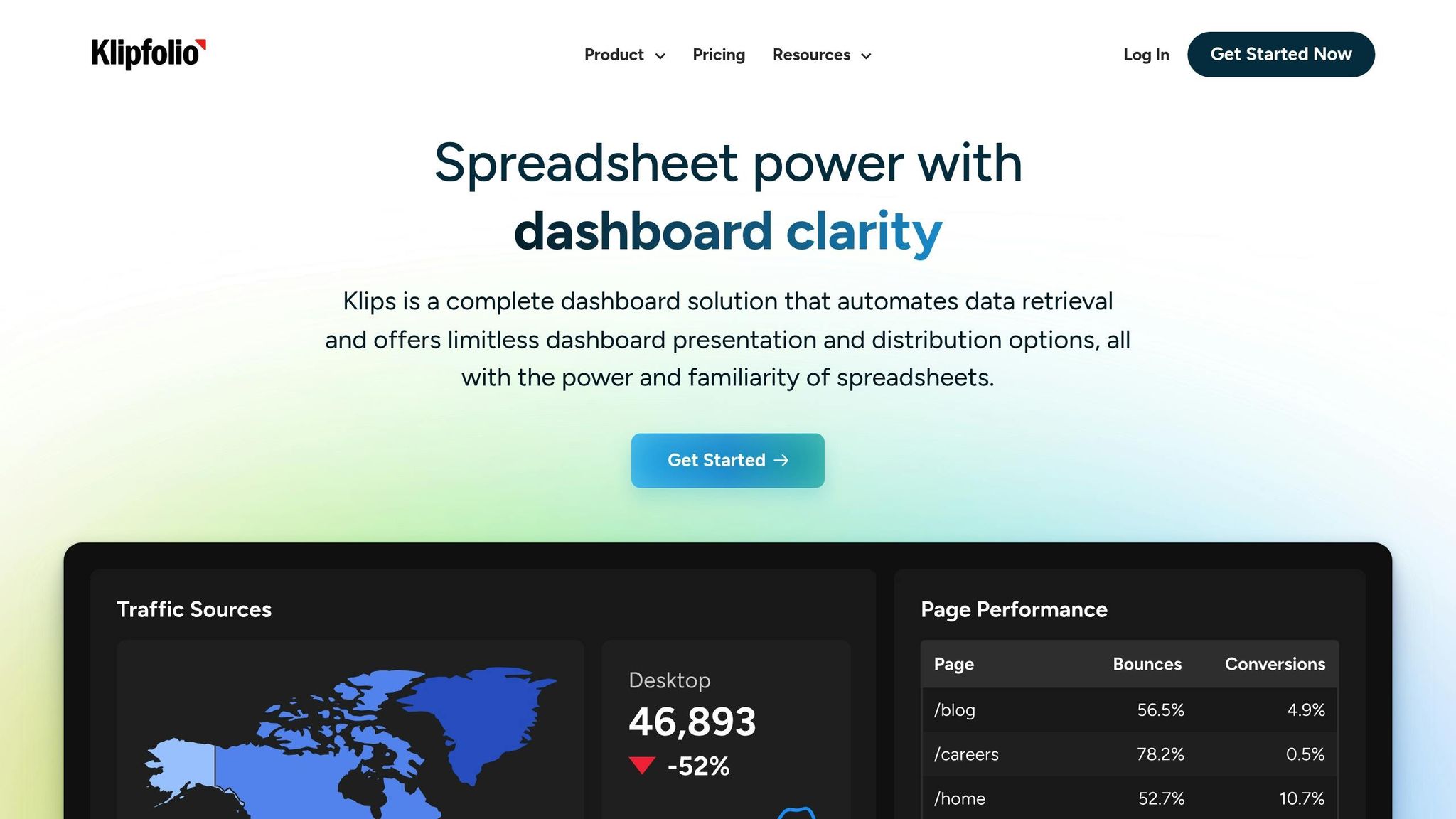
Klipfolio is a cloud-based BI platform that helps PR teams stay on top of their game by offering highly customizable dashboards. These dashboards are designed to simplify the process of visualizing and managing complex, multi-channel campaign data. Klipfolio provides two main tools: PowerMetrics, for straightforward metric tracking, and Klips, which allows users to build fully customized dashboards. This flexibility ensures PR teams can tailor their reporting to meet the specific needs of their organization.
Customizable Dashboards
Klipfolio gives PR teams the freedom to design dashboards that align perfectly with their brand. Its drag-and-drop interface makes it easy to adjust layouts, apply custom themes, and even integrate unique colors, logos, and fonts. For those who want even more control, Klipfolio supports custom CSS. Users can also create personalized widgets and tweak chart color palettes to emphasize the most important metrics. This attention to detail ensures that dashboards not only deliver valuable insights but also maintain a polished, professional look - ideal for sharing with stakeholders.
Integration Capabilities
One of Klipfolio's standout features is its ability to integrate with a wide range of platforms. With over 100 pre-built connectors and more than 250 pre-built metrics, PR teams can pull data from tools like social media platforms, Google Analytics, press release distribution services, and even custom databases. The platform supports data connections through pre-built connectors, APIs, and custom queries. This means PR teams managing multi-channel campaigns can centralize their data in one dashboard, providing a real-time view of social media engagement, website traffic, and media mentions. This seamless integration makes it easier to monitor and analyze campaign performance across different channels.
Real-time Analytics
Klipfolio's real-time data visualization is a game-changer for PR professionals. It allows teams to track key metrics and campaign performance as events unfold. This instant access to up-to-date information is especially valuable during critical moments, like product launches, crisis management, or time-sensitive campaigns. Teams can monitor media coverage and audience engagement in real time, enabling them to adjust strategies on the fly. Whether it's tracking social media interactions, website traffic trends, or media mentions, this real-time functionality provides the insights needed to make quick, informed decisions. It also helps PR teams demonstrate their impact to stakeholders by showing immediate results from their efforts.
White-label Options
For agencies looking to impress clients, Klipfolio offers white-label functionality. This feature allows agencies to fully customize dashboards and reports with their own branding - logos, colors, and even domains. The result? A seamless, professional presentation that builds trust and reinforces the agency's credibility.
| Plan | Price (USD/month) | Dashboards | Users |
|---|---|---|---|
| Starter | $19 | 2 | 1 |
| Standard | $29 | 5 | 2 |
| Pro | $49 | 10 | 5 |
| Premier | $89 | 20 | Unlimited |
Klipfolio's pricing starts at $19 per month, making it an affordable option for small PR teams and agencies. With several plans available, organizations can pick one that fits their current needs while leaving room to scale as their reporting demands grow.
3. Whatagraph

Let’s take a closer look at Whatagraph, a tool that’s making waves with its intuitive and customizable dashboards, specifically designed for PR teams. This platform transforms raw campaign data into polished, branded reports, all without requiring technical know-how - perfect for agencies juggling multiple clients.
Customizable Dashboards
Whatagraph’s drag-and-drop dashboard builder gives PR teams total control over how their data is displayed. Need to speed things up? The platform also offers pre-built templates with proven layouts. From there, you can tweak everything - colors, fonts, and visual elements - to align with your campaign goals and branding.
This level of customization is a game-changer for agencies managing several clients. Each dashboard can be uniquely tailored and branded, ensuring every client gets a report that feels like it was built just for them. The platform also supports a variety of visualization widgets like line graphs, bar charts, pie charts, tables, and custom metric displays. These tools make it easy to spot trends in media coverage and communicate results in a way that’s clear and impactful.
Integration Capabilities
Whatagraph connects seamlessly with over 100 platforms, including social media giants like Facebook, Twitter, and LinkedIn, as well as analytics tools like Google Analytics. For US-based teams, integrations with platforms like Google Ads, HubSpot, and Salesforce make it simple to unify reporting across multiple digital channels.
One standout feature is the platform’s custom data integration via SQL and its drag-and-drop formula builder. This lets PR teams pull data from proprietary databases or specialized PR monitoring tools, automating the reporting process. By eliminating manual updates, teams can focus on strategy and analysis while Whatagraph handles the heavy lifting of data aggregation.
White-label Options
For agencies looking to maintain a professional edge, Whatagraph’s white-label functionality is a must. You can fully brand dashboards with custom logos, color schemes, and even domain names. This ensures the reports look like they were developed in-house, bolstering credibility with clients.
In the competitive US market, this feature helps agencies stand out and build trust. Every visual element, from header colors to footer text, can be tailored to match brand guidelines, making reports feel polished and proprietary.
Real-time Analytics
Whatagraph keeps PR teams ahead of the curve with real-time data updates. The platform syncs automatically with connected accounts throughout the day, ensuring you’re always working with the latest numbers. Whether you’re tracking media coverage, engagement metrics, or campaign performance, this real-time capability is invaluable - especially during high-pressure moments like product launches or crisis management.
For PR professionals operating in fast-paced media environments, this feature allows for quick responses to emerging trends. Teams can jump on viral opportunities or address negative sentiment without waiting for end-of-day summaries. Reports can be downloaded in PNG or PDF formats, or shared via smart links for live dashboard access, giving stakeholders the flexibility to view data however they prefer.
| Plan | Price (USD/month) | Dashboards | Users |
|---|---|---|---|
| Starter | $19 | 2 | 1 |
| Standard | $29 | 5 | 2 |
| Pro | $49 | 10 | 5 |
| Premier | $89 | 20 | Unlimited |
Pricing starts at just $19 per month and scales up for larger organizations needing advanced integrations and professional white-label options.
4. Tableau
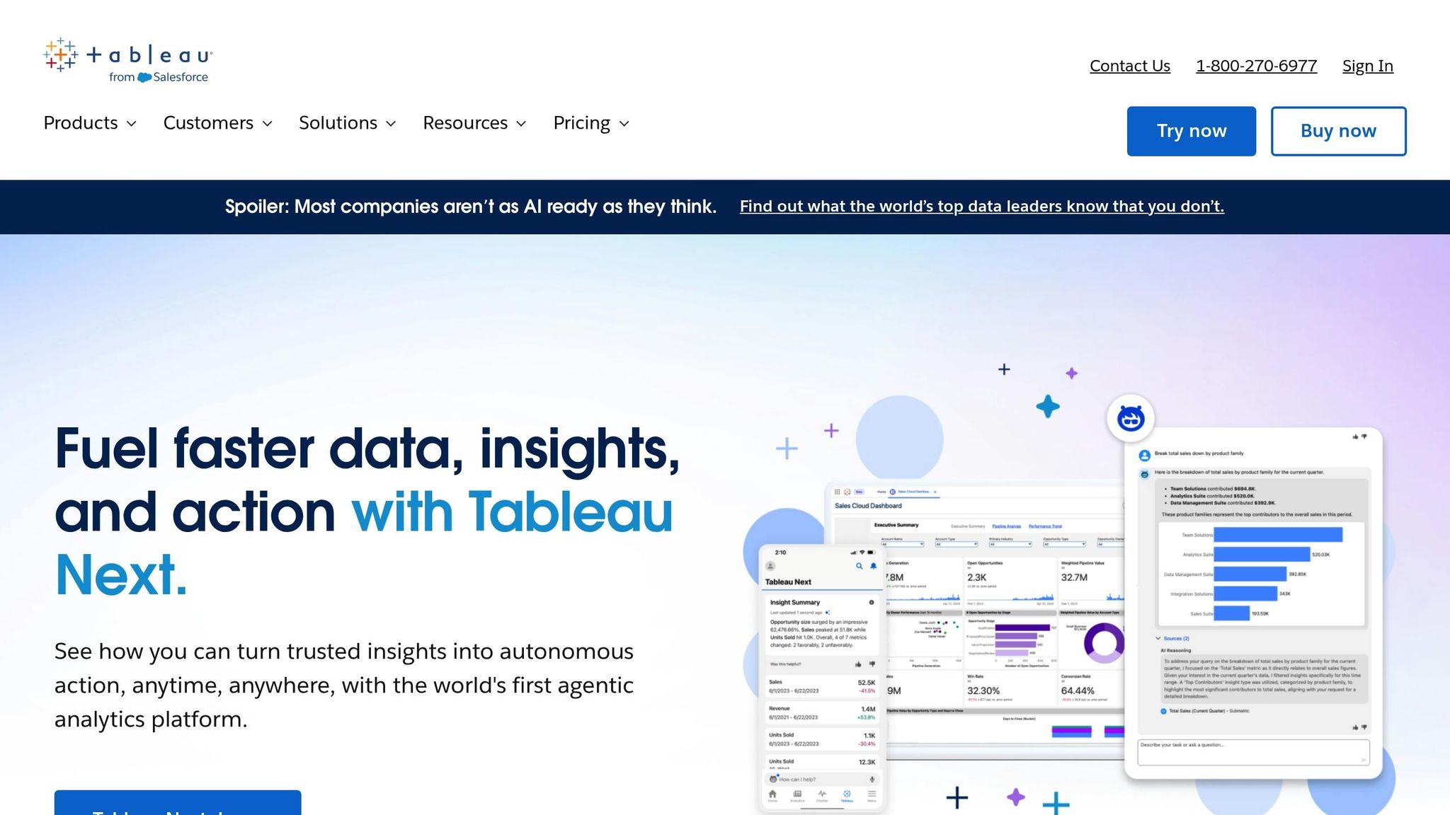
When it comes to high-level data visualization, Tableau stands out as a powerful tool for PR teams needing advanced analytics and customizable dashboards. Trusted by over 86,000 organizations globally, including major enterprises and government agencies, Tableau has built its reputation on offering reliable performance and the ability to scale for large operations[4].
What makes Tableau particularly appealing is how well it handles complex data relationships. For PR professionals managing intricate campaigns across multiple channels, this means diving deep into data without being bogged down by technical hurdles. The platform empowers teams to craft dashboards that are specifically designed to meet the unique demands of their campaigns.
Customizable Dashboards
Tableau’s drag-and-drop interface makes creating dashboards simple, even for those without technical expertise[6]. Teams can customize layouts, choose from a variety of visualization styles, and even align dashboards with their company’s branding[2]. Interactive features like dynamic filters, drill-down actions, and custom tooltips provide flexibility. For PR teams juggling multiple campaigns, parameter controls allow users to toggle between different campaign views or time frames with ease.
Integration Capabilities
One of Tableau’s strengths is its ability to integrate seamlessly with over 100 native connectors and unlimited API-based connections. This means PR teams can pull data from media monitoring tools, social platforms, Google Analytics, CRM systems like Salesforce, and other analytics platforms into one unified dashboard[2][4]. Additionally, Tableau supports major data warehouses, which is crucial for organizations managing PR data across departments or syncing campaign metrics with broader business intelligence efforts.
Real-time Analytics
Tableau’s real-time analytics capabilities align perfectly with the fast-paced nature of PR. With live data connections, PR teams can stay ahead of breaking news and track emerging trends as they happen[2]. Dashboards refresh automatically as new data flows in, making them especially valuable during product launches, active campaigns, or crisis situations. Whether monitoring live social media mentions, tracking media coverage, or analyzing engagement spikes during key announcements, Tableau allows PR professionals to make quick, informed decisions when it matters most.
| User Type | Price (USD/month) | Capabilities | Best For |
|---|---|---|---|
| Viewer | $15 | View and interact with dashboards | Stakeholders and executives |
| Explorer | $42 | Create and edit workbooks | PR analysts and managers |
| Creator | $70 | Full development and admin features | Dashboard builders and IT teams |
With pricing ranging from $15 to $70 per user per month (billed annually)[4], Tableau is clearly designed with enterprise needs in mind. While its cost may be higher than some alternatives, the platform’s robust analytics and scalability often justify the investment for organizations handling complex reporting. Tableau consistently earns high ratings - 4.5 out of 5 on major review platforms - with users praising its visualization power and analytical depth. However, some note that its advanced features come with a steeper learning curve and a premium price tag[4].
For PR teams seeking advanced analytics, secure data handling, and flexible visualization options, Tableau is a top contender. Its ability to deliver real-time insights and integrate seamlessly with other tools makes it a valuable asset for data-driven decision-making.
5. Domo
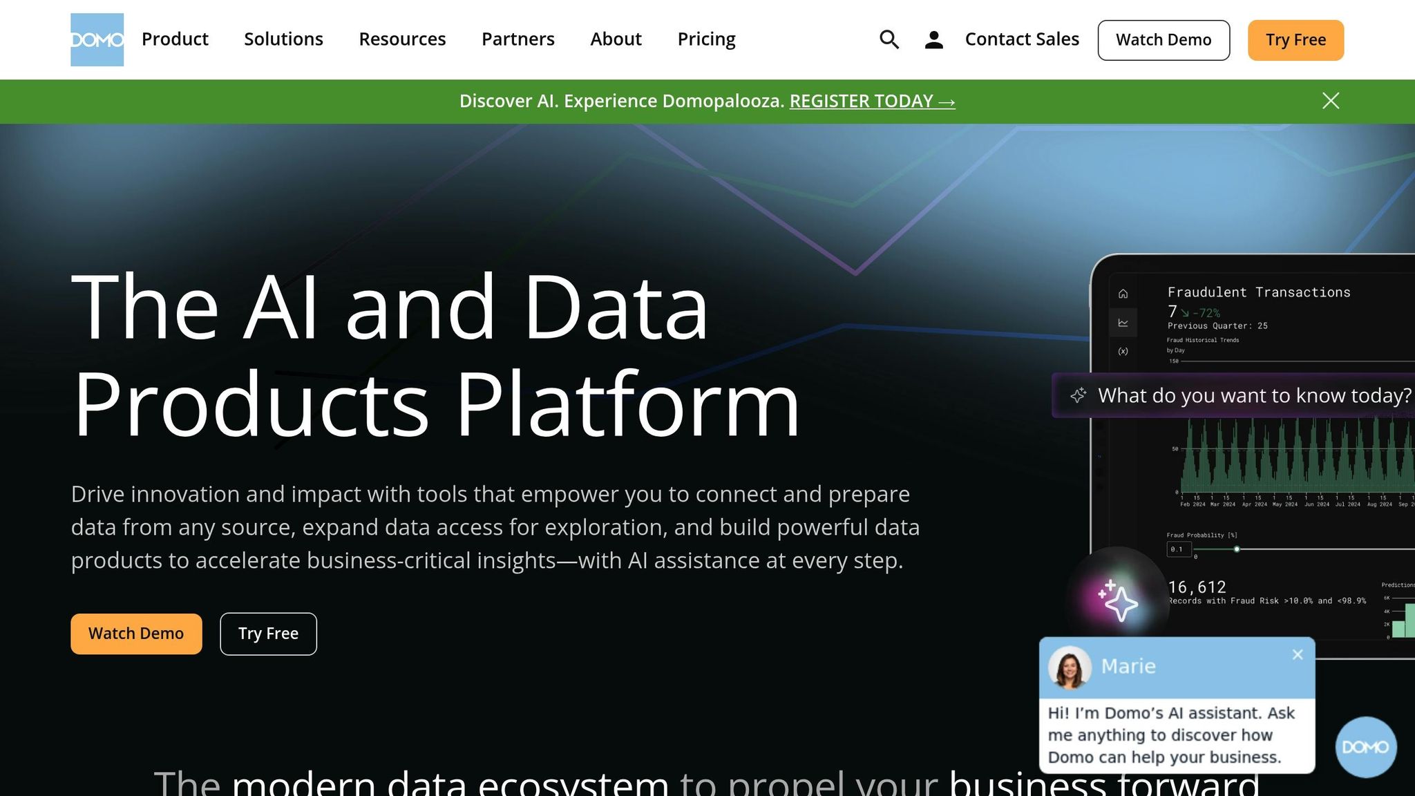
Domo is a cloud-based business intelligence (BI) platform trusted by thousands of organizations, including Fortune 500 companies. Its no-code dashboard builder makes data visualization accessible to PR professionals, enabling them to transform raw data into actionable insights. Domo's standout feature is its ability to consolidate data from various sources, empowering PR teams to make informed decisions across campaigns.
Customizable Dashboards
Domo's dashboard customization stands out thanks to its user-friendly drag-and-drop interface and a versatile widget library. PR teams can create widgets tailored to metrics like media sentiment, share of voice, or campaign reach - all without needing to write a single line of code[1]. The platform offers both pre-designed templates and full customization options, ensuring dashboards meet specific reporting needs.
Beyond functionality, Domo allows teams to incorporate branding elements like logos, color schemes, and fonts, ensuring consistency across all reports[2]. For embedded dashboards, Domo even supports custom CSS, enabling agencies to maintain a polished and professional look in their campaign presentations.
For example, a PR agency managing multiple client campaigns used Domo to integrate data from media monitoring tools, social media platforms, and Google Analytics into custom dashboards. This approach enabled real-time tracking of earned media mentions, sentiment analysis, and engagement metrics - leading to better campaign performance and happier clients[1].
Integration Capabilities
Domo shines when it comes to integrating diverse data sources. With over 1,000 pre-built data connectors, it tackles one of PR's biggest hurdles: fragmented data[1]. The platform connects seamlessly with key tools such as Google Analytics, media monitoring services, CRM systems, email marketing software, and social platforms like Twitter, Facebook, and LinkedIn.
Whether your data is stored in the cloud or on-premises, Domo adapts to your IT setup. This automation eliminates hours of manual data gathering each week, giving PR teams more time to focus on strategic tasks while centralizing all insights in one place.
White-label Options
Domo also offers white-label capabilities, allowing agencies to embed dashboards that reflect their unique branding[2]. Whether dashboards are public or private, organizations can control data visibility for different stakeholders[1]. This feature is especially useful for agencies that need to present branded, client-facing reports.
Real-time Analytics
Domo’s real-time analytics are a perfect match for the fast-paced world of PR[1]. Live updates on media coverage, social interactions, and campaign performance allow teams to quickly identify trends, address emerging issues, and adjust strategies on the fly.
This is especially critical during product launches, crises, or time-sensitive campaigns. For instance, PR professionals can monitor shifts in sentiment, track viral content, and measure the immediate impact of press releases or social posts. Acting on real-time data can make the difference between seizing an opportunity and missing it entirely.
Domo also prioritizes data security. Its robust search features and user permission settings ensure sensitive information is accessible only to authorized team members[1]. This is particularly important for agencies managing confidential client data or handling delicate corporate communications.
Considerations and Expert Insights
While Domo offers a wealth of features, there are a few things to keep in mind. Its enterprise focus means pricing often begins at several hundred dollars per user per month for large-scale deployments. Additionally, while the no-code interface simplifies dashboard creation, setting up complex data environments can take time and careful planning to ensure accuracy[1].
Experts often highlight Domo’s flexibility, ease of use, and integration capabilities as major strengths for PR teams. It’s particularly effective for organizations needing to combine data from multiple sources and present it in visually engaging formats. However, its cost and setup complexity may pose challenges for smaller teams or those with limited resources[1][3].
For PR teams seeking advanced data visualization, seamless integrations, and real-time analytics, Domo offers a powerful solution designed to scale with organizational growth. It’s an enterprise-grade tool well-suited for large-scale PR campaigns.
Feature Comparison Table
To help you evaluate PR dashboard tools, here's a side-by-side comparison of their key features and pricing:
| Tool | Customizable Dashboards | Integration Capabilities | White-Label Options | Real-Time Analytics | Pricing (USD/month) |
|---|---|---|---|---|---|
| Pressmaster.ai | Branded newsrooms with custom layouts, colors, and content modules | PR-specific integrations with press networks and CMS platforms | Full white-label platform for agencies with custom branding | Real-time performance tracking and campaign analytics | Custom pricing (free trial available) |
| Klipfolio | Drag-and-drop builder with custom widgets and unlimited styling options | 130+ pre-built connectors with API support and SSO capabilities | Custom domains, logos, and color schemes for client dashboards | Live data feeds with auto-refreshing dashboards | $47–$799 (unlimited users) |
| Whatagraph | Modular widgets with drag-and-drop creation and custom branding elements | 100+ integrations with marketing channels and social platforms | Custom branding and domain options for agency reporting | Near real-time reporting with frequent data syncs | $249–$499+ (5–10 users) |
| Tableau | Advanced visualization with custom themes and interactive elements | 50+ connectors for databases, cloud services, and third-party apps | Limited branding options compared to dedicated white-label solutions | Live data connections with interactive real-time dashboards | Free desktop version; Pro/Premium custom pricing |
| Domo | No-code builder with custom widgets and extensive layout personalization | Over 1,000 pre-built data connectors with cloud and on-premises support | Custom branding with CSS support for embedded dashboards | Real-time data visualization with live updates | Quote-based enterprise pricing |
Key Insights
Pricing: These tools cater to different budgets and team sizes. Klipfolio stands out with its unlimited user model starting at $47/month, making it suitable for growing teams. Whatagraph, on the other hand, targets mid-sized agencies with plans beginning at $249/month. Domo and Tableau offer enterprise-level solutions with custom pricing, while Pressmaster.ai provides tailored pricing, including a free trial.
Integration Capabilities: Domo leads with over 1,000 data connectors, accommodating both cloud and on-premises systems. Pressmaster.ai, however, focuses on PR-specific integrations, making it ideal for teams that prioritize media coverage and campaign tracking.
White-Label Options: Pressmaster.ai offers full platform white-labeling for agencies, allowing complete rebranding. Klipfolio and Whatagraph provide dashboard-level white-labeling, including custom domains and branding. Tableau, while offering advanced visualizations, has more limited branding options.
Real-Time Analytics: All platforms feature real-time data capabilities, but their focus varies. Domo and Tableau excel in enterprise-grade real-time updates, while Pressmaster.ai delivers PR-specific insights like sentiment analysis and campaign performance.
Usability and Customization: Tableau's advanced visualizations and interactive dashboards are unmatched but can overwhelm smaller PR teams. Pressmaster.ai simplifies this by offering branded newsrooms and layouts tailored to PR workflows, requiring minimal technical expertise. Klipfolio's drag-and-drop builder makes it user-friendly for teams of all sizes, while Whatagraph's modular design is ideal for agencies but may become expensive as they scale.
Final Thoughts
Each tool has its strengths, but no single platform dominates every category. Your choice will depend on your team's size, PR goals, and budget. For example, smaller teams may appreciate the simplicity of Pressmaster.ai, while larger enterprises might lean toward Domo or Tableau for their robust capabilities. Carefully assess your needs to find the right fit.
Conclusion
Customizable PR dashboards bring all your data into one place and simplify the process of gathering insights, making PR workflows smoother and more efficient. Tools like Pressmaster.ai, Klipfolio, Whatagraph, Tableau, and Domo each come with their own strengths, offering features that can help your team work smarter and improve reporting.
When choosing the right dashboard, it's important to consider factors like the size of your team, how tech-savvy your team members are, and your budget. Integration is another key factor - your ideal tool should work effortlessly with your current PR and marketing systems. For agencies handling multiple clients, white-label options are a must-have for maintaining a polished and professional image.
The push toward AI-driven automation in PR dashboards is gaining momentum. Platforms such as Pressmaster.ai are leading the charge by combining tools for content creation, distribution, and analytics all in one place. This shift allows teams to manage campaigns from start to finish - brainstorming ideas, executing strategies, and measuring results - using a single platform. In the evolving world of PR, AI-powered automation is set to redefine how campaigns are managed, making every step more efficient and impactful.
FAQs
How can customizable PR dashboards improve the way PR teams manage campaigns?
Custom PR dashboards simplify campaign management by giving PR teams a single hub to monitor, evaluate, and refine their efforts. These dashboards deliver real-time insights, helping teams make informed decisions and tweak strategies as needed.
Using platforms like Pressmaster.ai, teams can build customized dashboards that match their unique objectives - whether it's keeping tabs on engagement, tracking media mentions, or assessing ROI. This adaptability not only boosts efficiency but also improves teamwork, ensuring campaigns remain focused and effective.
What integration features does Pressmaster.ai offer for PR professionals?
Pressmaster.ai connects effortlessly with your website, content management system (CMS), and social media platforms. This makes publishing and managing PR content across various channels a breeze.
By simplifying the process, it helps you deliver your content to the right audience quickly and with a polished, professional touch.
How does real-time analytics in Pressmaster.ai help PR teams manage crises or run time-sensitive campaigns effectively?
Real-time analytics in Pressmaster.ai gives PR teams the tools they need to act swiftly and effectively during crises or fast-paced campaigns. By delivering instant insights on content performance, audience reactions, and media coverage, it enables teams to make smart, data-driven decisions and adapt their strategies in real time.
Features like trend analysis and performance tracking help ensure your messaging remains sharp and effective, allowing you to minimize risks and drive success, even when the clock is ticking.
Related Blog Posts






Sign Up for our Pressmaster Newsletter
Sign up for our Pressmaster.ai newsletter to get instant alerts on trending topics, ensuring you stay ahead in your field with the latest insights and updates.


.avif)
.png)

.avif)


7 Viral Patterns That Drove 10,643% Growth
Turn natural conversations into content gold, make every insight count, and drive real conversations.

Please fill out the form to get our Viral Cheat Sheet


How to Become a Thought Leader in 6 Easy Steps
Increase your visibility, establish authority, and conquer your market with minimal effort.

Please fill out the form to get our PDF Checklist
